Bridging Art and Engineering: Finding Meaning in the Visual Language of Data
Edward Tufte once wrote that “beautiful evidence” is what happens when information is presented so clearly, so thoughtfully, and so accessible that it reveals truths and insights that might otherwise remain hidden.
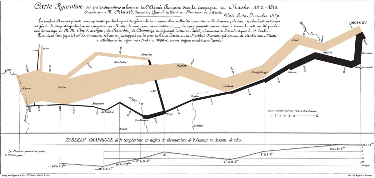
From Galileo’s sketches of the heavens to Minard’s haunting 1869 chart of Napoleon’s doomed march on Moscow, history is filled with examples of data transformed into art. Minard’s map, in particular, told an epic story in a single image, one that showed temperature, geography, direction, and devastation in the same elegant stroke. It was not just a map; it was a mirror of human experience rendered in numbers and form.
Today, our challenge is the opposite. We are drowning in dashboards, graphs, and data feeds, yet we often see less than ever before. The problem isn’t access to information; it’s our inability to understand it, to feel it. As designers and engineers, our job is no longer to display data; it’s to reveal meaning.
This is where art and engineering meet.
Engineering gives us logic, structure, and repeatability. Art gives us emotion, abstraction, and the courage to remove what doesn’t belong. When these disciplines merge, the result is something profoundly human: interfaces that don’t just inform but speak.
In my own work designing health systems, I’ve learned that clarity isn’t just visual, it’s emotional. People shouldn’t need to interpret their well-being through spreadsheets or line graphs. They should be able to see and feel it, intuitively. The right use of color, movement, and shape can express balance or imbalance faster than numbers ever could. It’s a language older than language itself.
Tufte calls this “layering and separation”, the art of showing multiple dimensions of information in a single, coherent view. When done well, data becomes multidimensional without becoming noisy. You don’t need to see every number to understand the pattern; your eyes just know.
I’ve taken that to heart. I’m currently exploring how the principles of visual storytelling can inspire awareness, not anxiety. My goal is simple: to make understanding data as effortless as looking at a painting, where beauty and insight coexist.
Design at its best is an act of empathy. It’s not about decoration or simplification. It’s about giving form to understanding, turning complexity into clarity, and clarity into motivation.
The future of data visualization won’t be static charts. It will be living systems that move with us, learn from us, and reflect who we are. Systems that make us feel the truth behind the numbers.
Because when information moves us, when we sense its beauty, that’s when design becomes evidence.