 FINDING DIRECTION
AI has accelerated the build cycle. Every new option can make the user’s task harder to see.
Back in 2012, twice a week, I traveled from Hartford to New York to work at the Salesforce offices in Hudson Square. From Penn Station, I went underground for the C or E to Spring Street.
I step onto the platform, and the hot, heavy air punches me in the face. It carries old train grease, urine along the walls, sweat, and food drifting down from the vendors above. The sounds press in from every direction. Trains scrape against the rails, brakes scream, and announcements break apart through old speakers.
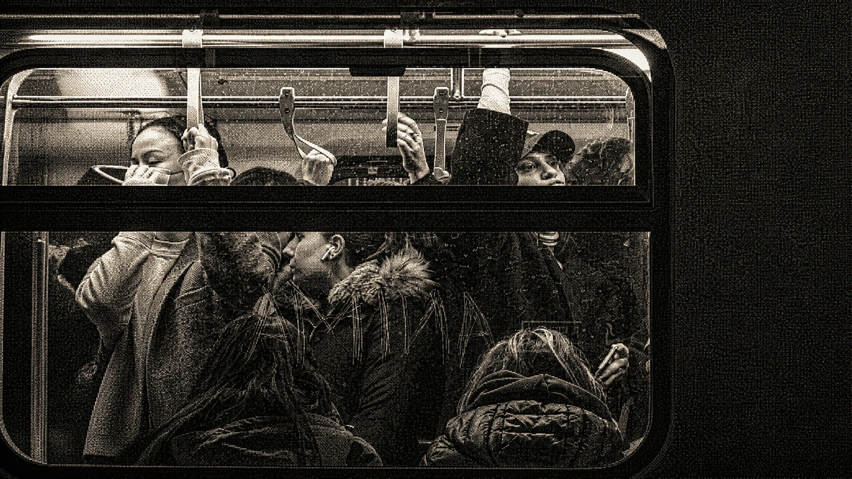
When my train arrives, the doors open onto an already crowded car. I squeeze inside, find enough room to stand, and reach for the rail. Hands already line it, leaving only a narrow place to hold without touching someone. A backpack presses against my side. Someone’s hair brushes my face. Once I have my footing, I have another problem.
Where to look.
The New Cost of a Feature
That question has followed me into application development. AI-assisted tools make it easier to move from an idea to working code. A new control, workflow, or dashboard can appear before a team has decided how it fits into the product.
Building a feature used to carry a more visible cost. Teams had to decide whether it justified the engineering time, what other work it would displace, and where development effort would have the most impact. AI-assisted development is lowering that barrier. Product judgment now has to happen more deliberately.
My years in UX design taught me to consider what each addition asks from the person who will use it. Every feature introduces a decision, a state to understand, and another possible place to look.
People usually arrive at an application with their attention already divided. They may be moving between messages, meetings, tabs, and the task in front of them. They scan the interface and decide quickly what deserves a closer look. Slowing down during development gives us time to decide what matters before the interface asks the user to make that decision.
[ FIELD NOTE / ACCUMULATION ]
Every feature spends some of the user’s attention. The product team needs to decide what deserves it.
Inside the subway car, every demand makes sense on its own. The MTA needs to announce service changes. Advertisers pay for attention. Performers need an audience. Passengers need space and somewhere safe to look. Together, they create an experience I have to sort out for myself. It always makes me uncomfortable. The train shifts and pushes me into someone beside me. Almost anywhere I look, another person is there. Looking in any direction feels uncomfortable, as if I were staring.
Products grow the same way. A request arrives from a customer, a metric, a sales conversation, or something a competitor released. Each request can be justified on its own. The product team owns what happens when they all meet in the same interface.
[ FIELD NOTE / OWNERSHIP ]
Feature teams own their additions. Product UX owns how those additions work together and complement one another.
Design the Whole Product
AI tools often work one request at a time. A component can be generated, reviewed, and accepted on its own while the seams accumulate around it: repeated controls, inconsistent language, competing alerts, and several ways to complete the same action.
The person using the application encounters the whole product. Before another component enters the development pipeline, the team needs to agree on the task it supports, where it belongs in the flow, and how much user attention it deserves.
Across the subway car, a map gives my eyes somewhere neutral to rest. It organizes a complicated network around the journey. I can see where I am, where the train is going, and how the other lines connect.
[ FIELD NOTE / CONTEXT ]
A stable interface shows people where they are, what changed, and what they can do next.
The map gives the larger journey an order. Each line, station, and transfer makes sense because I can see how it connects to the route I am taking. Product UX provides that same orientation by connecting each feature to the task and to the rest of the product.
A Broader Definition of Done
In a fast build cycle, functional acceptance can become the finish line: the control renders, the agent responds, and the data saves. A feature can pass those checks while leaving its purpose or priority unclear.
UX review includes the surrounding experience. A person should know when to use the feature, recognize its current state, recover from an error, and ignore it when it is irrelevant. Some capability belongs behind a next step or inside a details view. Some should wait outside the product until the need is clear.
[ FIELD NOTE / ACCEPTANCE ]
Completion includes the surrounding experience: purpose, priority, state, and recovery.
When we reach Spring Street, I follow the crowd toward the stairs. The mechanical noise recedes as I climb. At the top, the streets, buildings, and sky give me enough reference points to understand where I am and continue toward my destination.
Faster build cycles give teams more opportunities to add. We need to slow down long enough to choose what belongs, decide what can wait, and keep the path through the interface clear.
Whatever I make, I want to give you a place to look, something to hold onto, and enough context to know where you are going.