 FINDING DIRECTION
Bridging art and engineering can turn data from a record of what happened into an experience of what it means.
In Beautiful Evidence, Edward Tufte examines how empirical observations become explanations and evidence presentations. His examples show what can happen when information is presented with enough clarity and care to reveal relationships that might otherwise remain hidden.
[ 01 / BEAUTIFUL EVIDENCE ]
Reading Minard’s Map
History is filled with data transformed into art, from Galileo’s sketches of the heavens to Charles Joseph Minard’s 1869 map of Napoleon’s march on Moscow. Minard told an epic story in a single composition. Geography, direction, temperature, time, and devastating human loss share the same visual field.
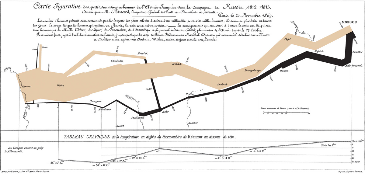
The path locates the army across the Russian campaign.
Color and movement distinguish the advance from the retreat.
The narrowing band makes the loss of life visible.
The lower register connects the retreat to the falling cold.
The map makes the relationship between distance, weather, direction, and loss immediately legible. It carries a human experience through numbers and form.
[ 02 / THE CURRENT PROBLEM ]
Too Much Information
Today, we are surrounded by dashboards, graphs, alerts, and live feeds. Access to information has grown faster than our ability to understand what deserves attention.
Displaying every available measure can turn information into noise. The work is to establish hierarchy, preserve the relationships that matter, and remove what does not help someone see the pattern.
Tufte calls this layering and separation: multiple dimensions organized into a coherent view. Done well, the result feels rich without becoming crowded. A person does not need to inspect every number before the pattern becomes clear.
[ 03 / ART + ENGINEERING ]
Art and Engineering
The work requires engineering’s logic, structure, and repeatability along with the judgment to use emotion, abstraction, and removal deliberately. Those decisions can produce interfaces that communicate before someone has inspected every value.
I have seen this directly in my work on health products. Clarity is emotional as well as visual. People should not have to interpret their well-being through spreadsheets and line graphs alone. Color, movement, and shape can communicate balance or imbalance before a person has parsed the numbers.
I am currently exploring how visual storytelling can support awareness without adding anxiety. I want to give form to understanding so that clarity can help someone decide what to do next.
[ 04 / WHAT COMES NEXT ]
Living Information
I expect data visualization to extend beyond static charts. Information can move with us, respond to context, and reflect changes as they happen. The visual language can remain calm while the underlying data stays alive.
Empathy enters through the decisions about what to show and how much someone should be expected to interpret. A good visualization helps people recognize what matters without making them carry the complexity behind it.
When information moves us, design becomes evidence.